

How to Identify Quality Screen Printing: A 2026 Guide
Table of Contents
- What Is High-Quality Screen Printing?
- The Importance of Ink Coverage and Opacity
- Understanding Registration and Alignment
- Plastisol vs Water-Based Ink Quality: Which Lasts Longer?
- Soft Hand vs Heavy Ink Feel: Finding the Right Balance
- Vibrancy and Color Accuracy: What to Look For
- Common Screen Printing Defects and How to Spot Them
- Wash Durability and Longevity Testing
- Tactile Testing Methods for Print Quality
- Post-Wash Degradation: What Happens After Multiple Washes
- Ink Chemistry and Its Impact on Print Quality
- Vendor Vetting Checklist: How to Choose a Reliable Screen Printer
- How to Identify Quality Screen Printing Before You Buy
- Conclusion
Last Updated: August 8, 2026
What Is High-Quality Screen Printing?
High-quality screen printing starts with understanding what separates a print that lasts from one that falls apart after a few washes. It's not just about how it looks when it arrives, it's about durability, comfort, and how the design performs over months of wear and washing.
A quality screen print combines three core elements: proper ink coverage that sits evenly across the fabric, correct curing that bonds the ink permanently to the garment, and appropriate ink selection for the fabric type and intended use. When these align, you get a print that remains vibrant, flexible, and intact through repeated wear and laundering.
At Ortrends, we focus on these fundamentals because they directly impact customer satisfaction. A print that cracks after two weeks of wearing defeats the purpose of investing in custom apparel. The difference between a cheap screen print and a quality one often comes down to decisions made during production, ink type selection, temperature control during curing, and attention to registration accuracy.

Most buyers can't see these decisions in a product photo. That's why learning to identify quality screen printing before you buy matters. You're looking for visual and tactile signals that indicate the printer invested in proper technique rather than cutting corners.
The Importance of Ink Coverage and Opacity
Ink coverage determines whether your design looks crisp and vibrant or washed-out and patchy. This is where many budget printers fail, they skimp on ink to save money, resulting in thin, translucent coverage that reveals the garment color underneath.
Quality screen printing requires sufficient ink deposit to achieve full opacity. This means the design appears as intended, with colors that match the original artwork and don't shift based on the garment's base color. When you hold a properly printed shirt up to light, the ink should block light rather than allowing it to pass through the design area.
The challenge is that more ink coverage adds weight to the print. This is where the balance comes in: enough ink to achieve opacity and durability, but not so much that the print feels heavy or stiff against your skin. Ortrends manages this by selecting ink formulations and application techniques that deliver full coverage without the plasticky feel that turns people away from graphic apparel.
Uneven coverage appears as patchy spots within the design, areas where the color looks lighter or thinner than surrounding areas. This typically indicates inconsistent squeegee pressure during printing or insufficient mesh count for the ink type being used. A quality screen printer maintains consistent pressure across the entire print stroke and uses appropriate mesh specifications for their ink selection.
Testing coverage is straightforward: examine the design under natural light from different angles. A quality print shows consistent color saturation across the entire design. If you notice lighter areas within the design or can see the garment color showing through the print, that's a sign of inadequate coverage.
Understanding Registration and Alignment
Registration refers to how precisely different color layers align when a multi-color design is printed. Perfect registration means each color layer sits exactly where it should, with no gaps between colors and no color bleeding into adjacent design areas.
When registration is off, you see visible gaps between colors or one color slightly overlapping another in ways the original design didn't intend. This looks sloppy and suggests the printer either lacks proper equipment or didn't invest time in setup and testing before running the job.
Quality screen printing requires careful attention to registration throughout production. The printer must ensure each screen is positioned precisely, the substrate stays in consistent position between color passes, and screen tension is uniform. This takes time and attention, it's not something you can rush.
Multi-color designs are where registration quality becomes most obvious. A two-color print with poor registration might go unnoticed by casual inspection, but a five-color design with misaligned colors looks immediately unprofessional. When evaluating screen-printed apparel, multi-color designs serve as a quality indicator: if the registration is tight and precise, the printer clearly has their process dialed in.
Plastisol vs Water-Based Ink Quality: Which Lasts Longer?
Plastisol and water-based inks represent fundamentally different approaches to screen printing, and each has distinct durability characteristics. Understanding the difference helps you predict how a print will perform over time.
Plastisol ink is PVC-based and creates a plastic film on the fabric surface. It cures through heat (typically 320-330°F) and bonds to the garment through adhesion rather than penetration. Plastisol prints tend to feel heavier and stiffer initially, though quality applications can achieve reasonable softness. The advantage: plastisol delivers excellent color vibrancy and opacity with relatively forgiving application. The drawback: plastisol doesn't breathe as well as fabric-integrated alternatives, and it can crack if the print flexes excessively before full cure.
Water-based ink penetrates the fabric fibers rather than sitting on top. It cures through evaporation and requires lower temperatures (typically 280-300°F). When applied correctly, water-based prints feel like part of the garment, soft, breathable, and integrated with the fabric. The advantage: superior hand feel and breathability. The challenge: water-based inks require more precise application, tighter mesh counts, and more rigorous curing to achieve durability equivalent to plastisol.
For longevity, both can deliver excellent results when properly executed. Plastisol prints are generally more forgiving of application errors and tend to maintain color vibrancy longer under UV exposure. Water-based prints, when properly cured, integrate with the fabric in ways that resist cracking and peeling because the ink becomes part of the garment structure rather than a surface coating.
The real differentiator isn't the ink type, it's the printer's expertise with that specific ink. A skilled printer using water-based ink will deliver a superior product to a careless printer using plastisol. Ortrends prioritizes ink selection based on design requirements and durability needs rather than defaulting to one approach.
When evaluating screen-printed apparel, the hand feel provides a clue about ink type. If the print feels soft and integrated, water-based ink was likely used. If it feels heavier and more plastic-like, plastisol was probably the choice. Neither is inherently better, but your preference for hand feel and breathability should guide your selection.
Soft Hand vs Heavy Ink Feel: Finding the Right Balance
The "hand" of a print refers to how it feels against your skin. Soft hand means the print feels integrated with the fabric, flexible, and barely noticeable when wearing. Heavy hand means the print feels stiff, plasticky, and distinctly separate from the garment.
This is where personal preference meets technical execution. Some people prefer the bold, tactile feel of a heavier print. Others, particularly those wearing apparel for extended periods, like nurses and healthcare professionals, prioritize comfort and prefer prints that feel like part of the garment.
Quality screen printing achieves soft hand without sacrificing durability. This requires selecting appropriate ink formulations, controlling ink deposit thickness, and ensuring proper curing. A printer can deliver a soft-hand print by using water-based or discharge inks, applying thinner ink layers, and curing at temperatures that fully set the ink without over-baking the garment.
The challenge: softer prints require more skill to execute. It's easier to apply heavy ink coverage and achieve a stiff print than to dial in precise ink deposit for a soft feel while maintaining opacity and durability. Budget printers often default to heavier applications because it's more forgiving.
Testing hand feel is simple, wear the garment. A quality soft-hand print should feel comfortable during extended wear without the design becoming a distraction. The print should flex with your body without cracking or peeling.
Ortrends prioritizes soft-hand printing because our audience, nurses working 12-hour shifts, pet lovers wearing apparel daily, people seeking comfortable everyday wear, values comfort alongside design quality. Our selection of premium cotton blends and careful ink application delivers prints that feel like part of your wardrobe, not a separate layer.

Vibrancy and Color Accuracy: What to Look For
Vibrant colors that match the original design indicate the printer invested in proper ink selection and color matching. Faded or muted colors suggest either poor ink quality, inadequate opacity, or incorrect curing temperature.
Color accuracy requires several things working together: the right ink formulation for the garment color, proper opacity so the design color dominates rather than blending with the fabric color underneath, and curing that sets the color without degrading it through heat damage.
Pantone color matching is the standard in the industry. Quality printers maintain Pantone ink libraries and can mix custom colors to specification. This level of precision ensures your design appears as intended rather than as an approximation.
When examining a screen-printed design, look for color consistency across the entire print. If some areas appear more vibrant than others, that indicates uneven ink coverage or inconsistent curing. The design should show the same color saturation from edge to edge.
Under natural light, a quality print shows rich, saturated colors. Under different lighting conditions (fluorescent, warm indoor light, daylight), the colors should remain consistent. If colors appear to shift dramatically depending on lighting angle, that suggests inadequate opacity or ink that's sitting on the surface rather than properly bonded.
Common Screen Printing Defects and How to Spot Them
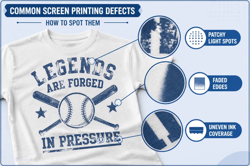
Understanding common defects and their root causes helps you identify quality issues before they become problems. Most screen printing defects fall into three categories: coverage issues, alignment problems, and durability failures. Each category has distinct visual and tactile signatures that reveal whether the defect is cosmetic or a sign of deeper process failure.
Patchy Spots and Uneven Coverage
Patchy spots appear as lighter areas within the design where ink coverage is insufficient. They're usually distributed randomly across the print rather than in a pattern, indicating inconsistent ink application during the printing process.
The root cause is typically inconsistent squeegee pressure. The screen printer applies pressure with a squeegee to force ink through the mesh onto the fabric. If pressure varies across the stroke, heavier on one side, lighter on the other, some areas receive more ink than others. This is a fundamental execution issue that reveals whether the printer has proper technique and equipment calibration.
Uneven coverage also occurs when the mesh count doesn't match the ink viscosity. Thicker inks (common with plastisol) require lower mesh counts (110-156 threads per inch) to allow ink passage. Using mesh that's too tight (200+ threads per inch) with thick ink results in incomplete ink transfer and patchy coverage. Water-based inks, which are thinner, require higher mesh counts (156-305 threads per inch) to prevent excessive ink flow. Mismatched mesh and ink viscosity is a sign the printer either doesn't understand their materials or didn't test before running the job.
To assess severity: minor patchiness (affecting less than 5% of the design area, appearing as small light spots) is often acceptable and may not affect durability. Significant patchiness (affecting more than 10% of the design, creating visible gaps in color saturation) indicates poor process control and often predicts durability issues because the thin areas are more prone to cracking and peeling during wear.
Quality screen printing maintains consistent squeegee pressure throughout the print stroke and uses appropriate mesh specifications. When you examine a print, hold it up to light and look for areas where the garment color shows through the design. Any visible gaps indicate inadequate coverage. If gaps are small and isolated, the print may still be acceptable. If gaps are distributed across the design or appear in critical areas (text, fine lines), request a reprint.
Faded Edges and Bleed Issues
Faded edges occur where the design color gradually transitions to the garment color, creating a fuzzy boundary instead of a crisp edge. This indicates insufficient ink opacity or inadequate curing. The ink sits on the fabric surface rather than bonding fully, allowing the garment color to show through at the edges.
Bleed refers to ink spreading beyond the intended design boundary. This typically happens when ink viscosity is too thin, allowing it to spread under the mesh during printing, or when the mesh is too low count for the ink being used. A 110-count mesh with water-based ink, for example, allows excessive ink flow and causes bleed. Bleed can also result from excessive squeegee pressure, which forces ink through the mesh and beyond the screen opening.
To assess severity: minor edge fading (a 1-2 mm soft transition) is often acceptable and may not affect durability. Significant fading (a 3+ mm blur where the design edge becomes indistinct) indicates poor opacity or curing and often correlates with durability issues. Bleed beyond the intended boundary by more than 1-2 mm is a quality failure that suggests the printer didn't properly prepare or test before running the job.
Both issues suggest the printer either selected inappropriate materials or didn't properly prepare and test before running the job. Quality screen printing produces crisp, well-defined edges with no color bleeding into surrounding fabric. If you receive a print with significant edge fading or bleed, contact the printer immediately. These defects often worsen during washing as the inadequately bonded ink begins to peel.
Cracking, Peeling, and Flaking
These defects appear during wear and washing, not immediately after printing. They indicate the ink didn't properly bond to the fabric, usually due to inadequate curing or substrate preparation. These are the most serious defects because they indicate imminent failure.
Cracking occurs when the print lacks flexibility. Plastisol prints that cure at insufficient temperature (below 300°F) feel stiff and crack when the garment flexes. The ink hasn't fully melted and fused with the fabric, so it remains brittle. Water-based prints that don't fully cure (insufficient dwell time in the oven or oven temperature below 280°F) also crack because the ink remains partially liquid and never fully sets.
To diagnose: perform the flex test immediately after receiving the garment. Bend the printed area firmly. If visible cracks appear after minimal flexing (bending the garment once or twice), the print was inadequately cured. Quality prints flex without cracking through at least 20 washes.
Peeling happens when the ink bond to the fabric is weak. This typically results from inadequate surface preparation (the fabric wasn't properly cleaned before printing, leaving oils or finishes that prevent adhesion) or curing at temperatures too low to achieve proper adhesion. Plastisol requires at least 320°F to fully cure; water-based requires at least 280°F. If the printer's oven doesn't reach these temperatures or the dwell time is too short, the ink never fully bonds.
Flaking is similar to peeling but appears as small pieces of ink separating from the garment. This indicates the ink never properly bonded to the substrate. Flaking often appears first at the print edges, where adhesion stress is highest.
To diagnose: perform the rub test. Rub the print firmly with your thumb for 10 seconds. If ink transfers to your thumb or if you feel the ink lifting from the fabric, adhesion is failing. Quality prints show no ink transfer and no lifting.
These defects are critical. If you observe cracking, peeling, or flaking within the first 5 washes, the print was inadequately cured or improperly applied. Contact the printer immediately and request a reprint. Do not accept prints with these defects as "normal wear", they indicate process failure, not normal degradation.
Registration and Alignment Issues
Registration refers to how precisely different color layers align when a multi-color design is printed. Perfect registration means each color layer sits exactly where it should, with no gaps between colors and no color bleeding into adjacent design areas.
When registration is off, you see visible gaps between colors (typically 1-3 mm) or one color slightly overlapping another in ways the original design didn't intend. This looks sloppy and suggests the printer either lacks proper equipment or didn't invest time in setup and testing before running the job.
To assess severity: minor registration drift (less than 0.5 mm, barely visible unless you look closely) is often acceptable in production runs, as perfect registration on every print is difficult to achieve at scale. Significant misalignment (1+ mm gaps between colors, visible to casual inspection) indicates poor process control and is a quality failure.
Quality screen printing requires careful attention to registration throughout production. The printer must ensure each screen is positioned precisely, the substrate stays in consistent position between color passes, and screen tension is uniform. This takes time and attention; it's not something you can rush.
Multi-color designs are where registration quality becomes most obvious. A two-color print with poor registration might go unnoticed by casual inspection, but a five-color design with misaligned colors looks immediately unprofessional. When evaluating screen-printed apparel, multi-color designs serve as a quality indicator: if the registration is tight and precise, the printer clearly has their process dialed in.
Wash Durability and Longevity Testing
True durability only reveals itself through actual washing. A print might look perfect when new but fail after a few wash cycles if it wasn't properly cured or bonded. Understanding what degradation looks like at different wash intervals helps you distinguish normal aging from premature failure.
Wash Cycle Benchmarks and Expected Degradation
Quality screen printing should survive at least 20-30 wash cycles without significant degradation, assuming standard home washing (warm water, standard detergent, normal dryer settings). Premium prints designed for professional or high-wear applications maintain quality through 50+ wash cycles. However, the degradation pattern matters as much as the endpoint.
After 1-5 washes, a quality print should show virtually no visible change. The color remains saturated, the edges remain crisp, and the ink feels as flexible as it did when new. If you notice fading, stiffening, or edge blur after just a few washes, the print was likely undercured or applied with insufficient opacity.
After 10 washes, minor color fading is normal, expect 5-10% loss of saturation depending on water temperature and detergent type. The print should still feel flexible when you bend the garment. If the print has become noticeably stiff or shows visible cracking at the flex points (shoulders, elbows, collar), adhesion was inadequate or the ink formulation was inappropriate for the fabric.
After 20 washes, color fading becomes more noticeable, expect cumulative 10-20% saturation loss. However, the print should remain intact with no peeling or flaking. The edges may show slight softening (a 1-2 mm blur where the design meets the garment), which is normal. If the print shows significant color shift, cracking across the design, or any peeling, the print failed to meet professional durability standards.
After 50 washes, quality prints show 20-30% cumulative color fading but remain structurally intact. The ink should not peel, flake, or crack. The edges may have softened further, but the design remains recognizable and the print remains flexible. Prints that crack, peel, or show dramatic color loss by this point indicate either poor initial curing, inadequate ink selection for the fabric type, or substrate preparation issues.
Testing Wash Durability Yourself
Documenting degradation requires consistency. Photograph the garment under identical lighting conditions (natural daylight, same time of day) after 1, 5, 10, 20, and 30 wash cycles. Use the same camera angle and distance for each photo to ensure comparability. This visual record reveals degradation patterns and helps you identify whether fading is gradual (normal) or sudden (indicating a curing or adhesion failure).
Wash the garment using your actual routine, don't use special care that differs from how you'll normally wear it. If you typically use hot water and a dryer, test under those conditions. If you hand-wash delicates, test that way. The durability claim should match your real-world use.
After each wash cycle, perform the flex test: bend the printed area firmly and look for cracks. Quality prints flex without visible cracking through at least 20 washes. If cracking appears before 10 washes, the print was inadequately cured.
Perform the rub test after 5 and 10 washes: rub the print firmly with your thumb for 10 seconds. Quality prints show no visible ink transfer to your skin. If ink transfers to your thumb, adhesion is failing and the print will likely peel within the next 5-10 washes.
Professional Durability Testing Standards
Quality screen printers perform accelerated wash testing using AATCC (American Association of Textile Chemists and Colorists) Test Method 61 or similar protocols. These tests simulate 20, 30, or 50 home wash cycles in a controlled environment using standardized temperature, detergent, and mechanical agitation. The test measures color change (using a spectrophotometer) and adhesion failure (visual inspection for cracking, peeling, or flaking).
When evaluating a printer, ask whether they perform AATCC testing and request the results. Quality printers maintain test data for their standard ink and fabric combinations. If a printer cannot provide this data or claims their prints are "guaranteed" without testing evidence, they likely don't have a rigorous durability protocol.
Ortrends tests durability on every design before offering it to customers, using AATCC protocols to simulate 30+ wash cycles. This ensures that when you receive a shirt or hoodie, the print has already proven it can withstand regular washing and wearing without premature failure.
Tactile Testing Methods for Print Quality
Tactile testing, using your hands to evaluate print quality, provides immediate feedback about several quality indicators without waiting for durability to reveal itself.
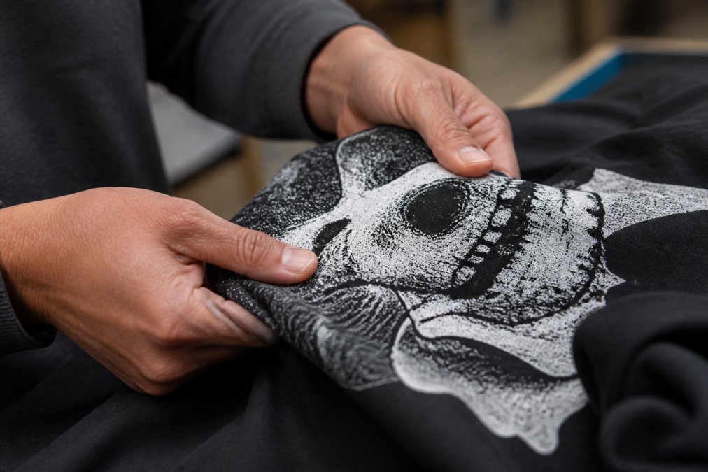
The flex test is straightforward: bend the printed area and observe whether the ink cracks. Quality prints flex without cracking. Poor prints show visible cracks after minimal flexing. This reveals whether the ink properly bonded to the fabric and whether curing was adequate.
The hand feel test evaluates comfort. Run your hand over the print. Does it feel integrated with the fabric or separate? Does it feel soft or plasticky? Quality prints feel like part of the garment. Poor prints feel like a stiff coating.
The rub test checks ink adhesion. Rub the print firmly with your thumb for several seconds. Quality prints show no visible ink transfer to your skin. Poor prints leave visible ink on your thumb, indicating the ink isn't properly bonded.
The edge test examines print definition. Run your finger along the edge of the design. Quality prints have crisp, well-defined edges. Poor prints have fuzzy edges where ink has bled beyond the intended boundary.
These tactile tests take 30 seconds and reveal significant quality information. They're particularly useful when evaluating samples before placing larger orders or when inspecting apparel after receiving it.
Post-Wash Degradation: What Happens After Multiple Washes
Post-wash degradation describes how a print changes after repeated laundering. Quality prints maintain color saturation, flexibility, and adhesion through multiple wash cycles. Poor prints show progressive fading, stiffening, and eventual cracking or peeling.
The degradation pattern reveals the underlying cause of failure. If a print fades progressively with each wash, the ink wasn't fully cured or the color wasn't properly set. If it stiffens over time, the ink formulation wasn't appropriate for the garment. If it cracks or peels suddenly after several washes, adhesion was inadequate.
Tracking degradation requires documenting the print's appearance after each wash. Photograph the garment under consistent lighting after 1, 5, 10, 20, and 30 wash cycles. This visual record reveals degradation patterns.
Quality screen printing shows minimal visible change across these milestones. The color remains saturated, the print remains flexible, and the adhesion remains intact. This consistency indicates proper ink selection, adequate curing, and correct application technique.
Ink Chemistry and Its Impact on Print Quality
Ink chemistry fundamentally determines print characteristics. Different ink formulations deliver different hand feels, durability profiles, and color properties.
Plastisol inks contain PVC particles suspended in a plasticizer. This formulation creates durable, vibrant prints but requires heat curing and produces heavier hand feel. The chemistry allows plastisol to maintain color saturation longer under UV exposure because the plastic coating provides inherent UV protection.
Water-based inks use water as the carrier, with pigments and binders dissolved or suspended in that water. The chemistry allows water-based inks to penetrate fabric fibers, creating softer hand feel and better breathability. However, water-based formulations require more precise application because the water evaporates quickly, and improper curing leaves the binder insufficiently set.
Discharge inks work by removing dye from the fabric rather than adding ink on top. This chemistry creates the softest possible hand feel because the print becomes part of the fabric color rather than a coating. However, discharge printing only works on dyed fabrics with reactive dyes, limiting its application.
Understanding ink chemistry helps predict how a print will perform. A plastisol print will likely maintain color vibrancy longer than water-based. A water-based print will feel softer and more comfortable for extended wear. A discharge print will feel most integrated with the fabric but requires specific fabric types.
Quality screen printers select ink chemistry based on the specific application requirements rather than defaulting to one approach. This decision-making directly impacts the final product's durability, comfort, and appearance.
Vendor Vetting Checklist: How to Choose a Reliable Screen Printer
Evaluating a screen printer before placing an order reduces the risk of receiving poor-quality prints. This checklist covers the key factors that indicate a printer has the capability and discipline to deliver quality work.
| Evaluation Factor | What to Look For | Why It Matters |
|---|---|---|
| Equipment | Modern curing oven, precise registration system, variable squeegee pressure control | Indicates ability to execute technical requirements |
| Ink Selection | Multiple ink types available, Pantone color matching capability | Shows printer tailors approach to design requirements |
| Quality Control | Sample testing before production, wash durability testing | Reveals commitment to consistency |
| Sample Provision | Willingness to provide samples before large orders | Demonstrates confidence in quality |
| Communication | Clear responses about process, timeline, and specifications | Indicates professional approach |
| Portfolio | Examples showing consistent quality across designs | Provides evidence of capability |
| Pricing Transparency | Clear pricing without hidden fees | Shows honest business practices |
Ask potential printers specific questions about their process. How do they cure prints? What mesh counts do they use? How do they test durability? Do they provide samples? What's their wash durability guarantee?
Quality printers answer these questions directly and provide evidence (samples, test results, portfolio examples). Printers who avoid specifics or provide vague answers likely cut corners.
Ortrends provides samples, detailed process information, and wash durability testing results because we're confident in our quality. This transparency helps customers understand what they're getting and why our prints outperform cheaper alternatives.
How to Identify Quality Screen Printing Before You Buy
The most practical approach combines visual inspection, tactile testing, and vendor evaluation. By the time you receive an order, you should have already identified quality indicators that predict how the print will perform.
Start with the vendor. Research their reputation, review their portfolio, and request samples. Quality printers invest in customer confidence because they're proud of their work.
Examine samples under multiple lighting conditions. Look for consistent color saturation, crisp edges, and even coverage. Flex the sample and perform the rub test. The print should flex without cracking and show no ink transfer to your skin.
Ask about their process specifically. Quality printers explain their ink selection, curing temperatures, and quality control measures. Vague answers suggest they don't have a rigorous process.
Inquire about wash durability. Quality printers can describe how their prints perform through multiple wash cycles and may provide test results. They should confidently guarantee durability through at least 20+ wash cycles.
Compare pricing carefully. Quality screen printing costs more than budget alternatives, but the difference should be justifiable through superior materials and process. If a printer's price is significantly lower than competitors, ask why. The answer often reveals cost-cutting measures that impact durability.
When you receive your order, inspect it immediately using the tactile tests described earlier. If the print fails these tests, contact the printer immediately. Quality printers stand behind their work and will address issues.
Ortrends customers consistently report that our prints maintain quality through extended wear and washing. This isn't luck, it's the result of careful vendor selection, rigorous process control, and commitment to durability over cost-cutting. When you choose Ortrends, you're choosing a printer that invests in quality because we know our customers deserve apparel that looks great and lasts.
Identifying quality screen printing requires understanding the technical factors that determine durability and appearance. From ink chemistry to curing temperature to registration precision, dozens of decisions during production impact the final product. By learning to recognize quality indicators, crisp edges, soft hand feel, consistent color saturation, and proven wash durability, you can make confident purchasing decisions. When you're ready to invest in apparel that truly lasts, look for a printer who can explain their process, provide samples, and guarantee durability. The Textile Exchange's sustainability standards emphasize quality and durability as core principles, reflecting industry recognition that lasting apparel matters. Ortrends meets these standards by prioritizing quality materials, proper curing, and rigorous testing. Shop Ortrends today and experience the difference that quality screen printing makes in comfort, durability, and design expression.
Frequently Asked Questions
What are the signs of a high-quality screen print?
High-quality screen printing shows crisp edges with no bleed, even ink coverage with no patchy spots, and vibrant color that matches the design specification. The ink should feel smooth and flexible, not stiff or cracked. When you run your finger across the print, it should have uniform thickness and a soft hand feel. The print should maintain its appearance after multiple washes without fading, cracking, or peeling. Premium screen printing uses proper curing techniques and appropriate ink types for the substrate.
How can you tell if a screen print will crack or peel?
Look for signs of improper curing, which is the most common cause of cracking and peeling. Bend the garment gently and inspect the print for existing cracks or stiffness. Poor curing leaves ink that feels brittle. Check the ink adhesion by running your fingernail lightly across the edge; quality prints won't flake. Examine the print for thick, uneven ink coverage, which creates stress points that crack during wear and washing. Water-based inks are more prone to peeling if not properly heat-set, while plastisol requires adequate tunnel temperature to cure fully.
What is the difference between plastisol and water-based screen printing quality?
Plastisol ink produces vibrant, opaque colors and excellent wash durability, but creates a heavier ink feel and can feel stiff on the garment. It's ideal for dark fabrics and designs requiring bold color. Water-based ink offers a softer hand feel and breathable finish, making it more comfortable for everyday wear. However, water-based prints require precise curing and may show less vibrancy on dark substrates. For longevity, both can last equally long if applied and cured correctly, but plastisol typically offers more forgiving production margins and better opacity on challenging fabrics.
How does mesh count affect screen printing quality?
Mesh count determines the detail level and ink deposit of your print. Higher mesh counts (305-400) create finer detail and crisper edges but deposit less ink, making them suitable for detailed artwork on light fabrics. Lower mesh counts (110-156) deposit more ink and work better for bold designs and dark garments. Quality screen printers match mesh count to the design complexity and substrate. Improper mesh selection leads to poor ink coverage, bleed issues, or insufficient detail. The right mesh count balances print sharpness with adequate ink thickness for durability.
Why does my screen-printed shirt fade after a few washes?
Fading typically results from inadequate curing or low-quality ink. Under-cured prints haven't properly bonded to the fabric and wash away gradually. Using cheap, low-opacity ink produces prints that look faded from day one and fade faster with wear. Substrate quality matters too; low-quality cotton breaks down faster, taking the print with it. Washing in hot water and drying on high heat accelerates fading. Premium screen printers use high-opacity inks, proper curing equipment, and quality blank apparel to ensure prints remain vibrant after dozens of washes.
What should you look for when inspecting custom apparel for print defects?
Inspect the entire print surface for patchy spots, thin areas, or uneven coverage. Check all edges for clean, crisp lines with no bleed or fraying. Look for color accuracy by comparing the print to the design specification. Feel the print texture; it should be smooth and consistent, not lumpy or stiff. Examine the substrate around the print for color transfer or staining. Check seams and hems to ensure they're straight and secure. Test the print flexibility by gently bending the garment; quality prints flex without cracking. Request a sample wash test if ordering in bulk to verify durability.
How long does quality screen printing actually last?
Quality screen printing can last 50+ washes or more when properly applied, cured, and cared for. Plastisol prints typically outlast water-based prints in durability, though both can achieve excellent longevity with correct production. The substrate quality matters significantly; premium cotton holds prints longer than cheap blends. Washing method affects longevity; cold water and air drying extend print life compared to hot water and high-heat drying. Signs of degradation include fading, cracking, peeling, or color shift. Ortrends uses premium materials and proper curing to ensure our prints maintain their appearance through regular wear and washing.
What is the role of curing in screen print quality?
Curing is the process of permanently bonding ink to the fabric through heat. Proper curing ensures the ink molecules cross-link with the fabric fibers, creating a durable, wash-resistant print. Under-cured prints feel sticky or stiff and peel or crack during wear and washing. Over-curing can degrade certain inks or damage delicate fabrics. Each ink type requires specific temperature and time; plastisol typically needs 320-330°F, while water-based inks require precise heat-set timing. Quality screen printers use calibrated heat tunnels or flash units to achieve consistent curing, which is why professional prints outlast amateur or DIY attempts.
This article was written using GrandRanker